The second Merry Mariner short story is out, and man, it's a good one! Click below to get it now, for pay-whatever-you-feel-like:
Download Waldo and the Spider's Sting
I'm really excited about this story, and the reason is that Waldo and the Spider's Sting is the most representative of what you can expect from the upcoming full Merry Mariner chapter books. Verona vs. the Doldrums was written as a sort of prologue, an introduction to the family and the ship, but with this story we get our first look at the colorful peoples and cultures on the Seven Seas. We'll travel to Marjoram, the City of Spires, visit the locals there and get a literal taste of their unique way of life, all while Waldo tries to chase down his escaped poisonous flying tarantula. That's what the chapter books will be - thrilling adventures in exotic, fantastic places.
But that's only the half of it.
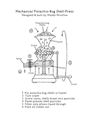
The other reason this story is representative of the full books is that it's chock-full of fun extra stuff. There's a map of Marjoram at the beginning, and at the end there's an Appendices section, including detailed scientific information on the story's infamous insects, schematics and blueprints of the machines Waldo builds, and even one of Mamma's recipes, all fully illustrated and as whimsical as the story itself.
This is also how the chapter books will be - full to bursting with all kinds of great bonus stuff. As a kid I used to love books like Dinotopia and the various Star Wars encyclopedias, which felt so much more real because they filled out the world in incredible detail, delving into the minutiae of life in these fantasy places. Maybe I can inspire other kids (or kids-at-heart like me) to dream up their own universes for me to travel to.
Another reason I'm excited about this story (what am I not excited about, really?) is that I'm visibly getting better at drawing, and illustrating for books, specifically. I'm still no Hergé, but I'm learning, and it shows.
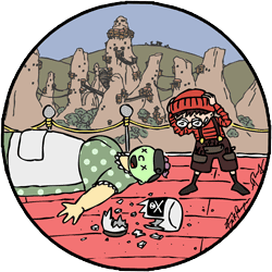
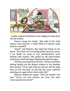
Here's an example of what I mean. Below is one of the illustrations from Verona vs. the Doldrums.
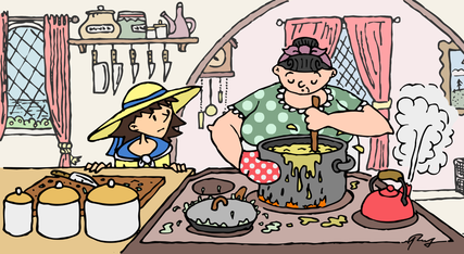
It looks more like a frame from an animated cartoon than an illustration from a book, doesn't it? That's not a good thing. Why does it look like a movie?
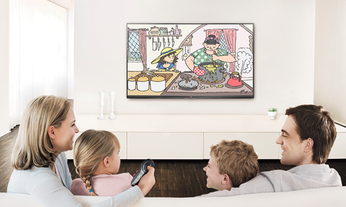
After getting really lovely feedback on the story and illustrations over the holidays, I settled on two reasons. First, it's a rectangle, with squared edges abruptly cutting off the background, and it even exhibits the same aspect ratio (length-width dimensions) as a film or television show. It looks like it could fit right on your TV.
After getting really lovely feedback on the story and illustrations over the holidays, I settled on two reasons. First, it's a rectangle, with squared edges abruptly cutting off the background, and it even exhibits the same aspect ratio (length-width dimensions) as a film or television show. It looks like it could fit right on your TV.
This is fine if you're looking at the drawings on a big plasma television or computer screen, but not when you're reading it in the context of the story. Book pages are portrait, not landscape-oriented rectangles. This drawing and many others like it in the book get scrunched up on the page, and it hurts immersion. It feels wrong somehow.
Clearly my background as a filmmaker is to blame - I'm used to thinking in landscape rectangles.
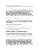
But there's another reason this doesn't look like a page out of a book: it's in color. One of the more interesting bits of feedback I received came from an elementary school teacher, who said that she much preferred the black and white version of Verona vs. the Doldrums because it actually felt less childish. The desire to be seen and treated as an adult is very important among my target age group, 6-12-year-olds. They don't want to be seen reading "kid's stuff," and brightly-colored drawings are like goofy saturday morning cartoons. Black and white, however, is more classic, more timeless, more adult, which is exactly what I'm going for. It's critical to me that the Merry Mariner stories don't feel like "children's books;" my golden ideal is Pixar, who manage to make films that truly appeal to All Ages.
I make a concerted effort not to "talk down" to kids in my writing - I just didn't know I could be doing it with my illustrating.
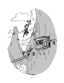
So when starting the drawings for Waldo and the Spider's Sting, I kept in mind these two points: 1) portrait orientation, 2) black and white. Here's a final full-page one from the story:
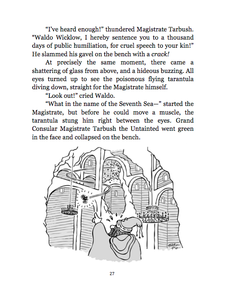
Now that's more like it! That, to me, feels much more like a classic, literary illustration. I've still got a lot to learn, but this is a big improvement. Even the drawings that aren't full page are designed to flow better with the text and bring you into the world:
So if you've already wandered over to the Stories page, you'll notice there's no color version available for Waldo and the Spider's Sting, and I've taken down the color version of Verona vs. the Doldrums (if you still want it, you can get it here). You can still pay what you want.
I think it's the right choice. Black and white, in a book anyway, feels both timeless and ageless.
Enjoy your trip to Marjoram, and watch out for flying tarantulas!
- M. Ray
I think it's the right choice. Black and white, in a book anyway, feels both timeless and ageless.
Enjoy your trip to Marjoram, and watch out for flying tarantulas!
- M. Ray

 RSS Feed
